How an early setback led to a UI revamp that increased engagement by 336%
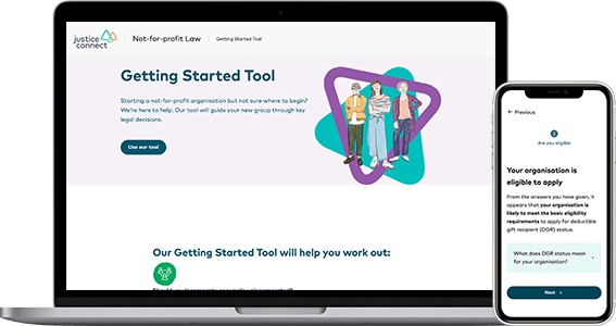
Project Overview
Project background
The Not-for-profit Law (NFP Law) program of Justice Connect has a collection of free online self-help tools aimed at helping not-for-profits achieve good governance and make sense of the law. The tools aim to help organisations navigate complex legal requirements through plain language and by providing a customised report.
The challenge
The tools had great feedback but low completion rates, and we were tasked with increasing the usage.
My role
- Part of a core team of 2, supported by others across the organisation.
- Lead the discovery phase to understand the tools, their users and their problems.
- Lead the User Experience Design, including ideation, creating sketches, building prototypes and UI design.
- Supported the product manager through user testing, when advocating for a changed project plan, and to develop a UX roadmap.
The solution
By simply rolling out a new UI to all the tools and improving the navigation and way-finding, we increased engagement by 336%. And this was only phase 1.
Problem and process
The tools had great feedback, but low completion rates
The tools helped not-for-profits navigate common legal issues that are specific to them. The feedback was constantly positive, but the data showed low completion rates for all tools.
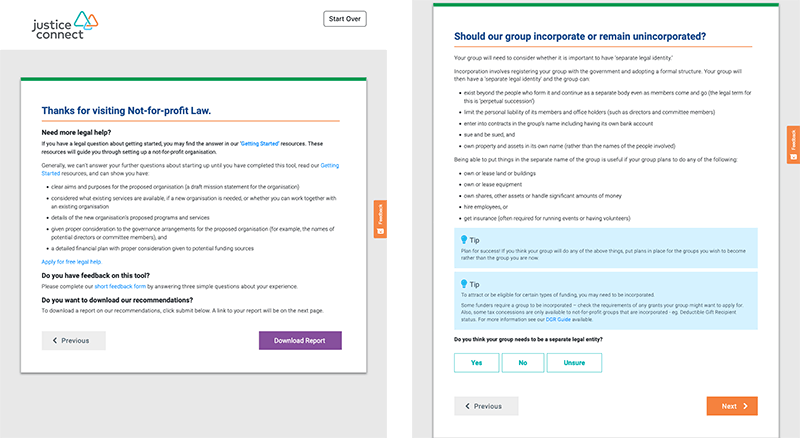
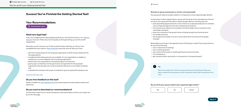
This is what the NFP Law Tools looked like.
Constraints:
- Changing the logic in the tools would take a lot of time.
- Any changes would need to be tested and reviewed by a lawyer, as these tools provide legal advice.
- We needed to have some changes live within four months to meet the funder agreement.
Process:
- Understanding the tools and the project plan
- Changing the project plan
- Ideation of solutions
- Prototyping and user testing
- Rolling out the changes
- Outcomes and what I learnt
Understanding the tools and the project plan
There were 6 tools, but we only had time to update 2
The plan was to pick 2-3 tools, review the flow, and make changes to improve usability and make them more effective. At the same time, we would make some basic UI updates to all the tools, making them accessible and bringing the branding in line with the organisational branding.
While doing our discovery work, we found that data tracking wasn’t set-up properly
Due to the tools set up, they were not tracking usage properly, so we didn’t know the real numbers of users who completed the tools or where they were abandoning. We were able to fix the set-up for data tracking, but we couldn’t wait for significant data.
Changing the project plan
We pivoted the project, successfully selling the updated plan to project sponsors
The initial plan was to base the improvements around abandonments, but without that metric, we would rely on user testing. But we were concerned that the poor UI would negatively influence user testing, and the data we gathered on any problems could be wrong.
New plan was to revamp the UI to be more accessible & usable
We didn’t know where the problems in the tools were, but we did know that the tools were not accessible, didn’t meet the organisation’s branding and failed various usability heuristics. We decided to focus on fixing these issues initially and setting up a good base from which to change the functionality of the tools in the future.
Ideation of solutions
How might we make the tools easy to use without changing any of the functionality
As we weren’t making any changes to the tools, we didn’t just want to update the UI to the existing Justice Connect Design System but add and test some new features that could add value to the users.
We ran some in-person :0 ideation sessions using whiteboards and paper to ideate and sketch ideas.
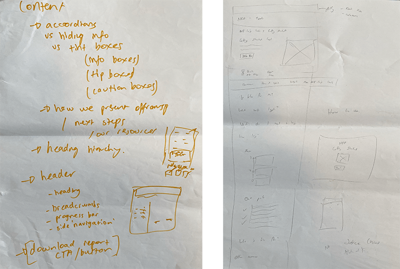
The tools were text heavy, full of legal nuance, and some were quite long. We wanted to set expectations before users started the tool and help them navigate the complexity without becoming overwhelmed. We used desktop research, existing archetypes, heuristic review and Hotjar recordings to inform our ideas.
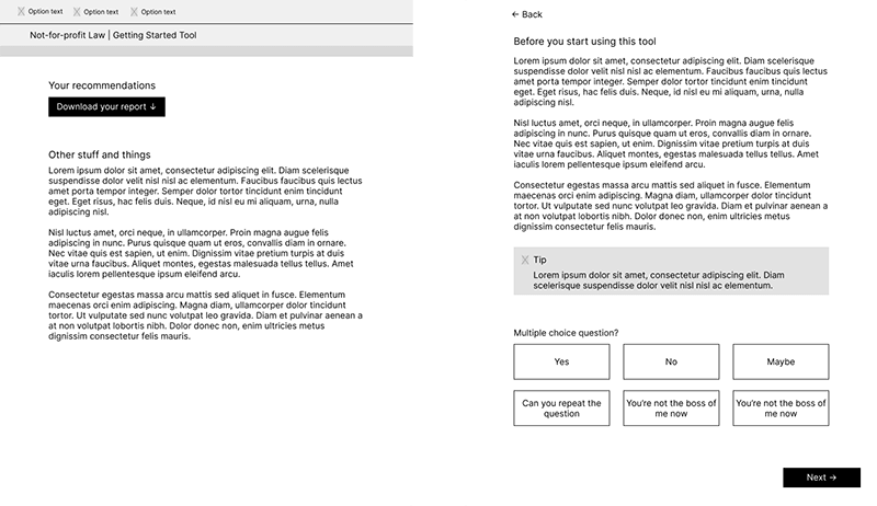
After ideation and sketching I created Wireframes.
Prototyping and user testing
We tested prototypes of our ideas with real users
We ran 3 user testing sessions with people who work or volunteer at not-for-profits to test our ideas.
We iterated the wireframes into a hi-fidelity prototype
We used what we learnt to update and prioritise the ideas
We only had time to make a few changes to our concepts, and we used the feedback to make minor changes and prioritise what was important. We knew our updated UI would not lead to a worse experience than what already existed, and we planned to do further testing in the future.
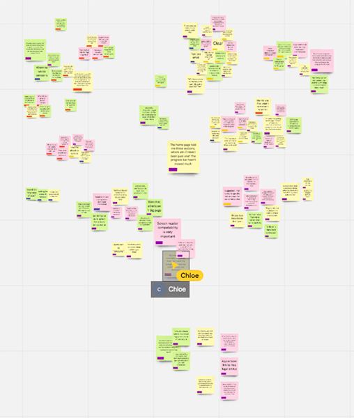
We synthesised the user testing data in Miro.
Rolling out the changes
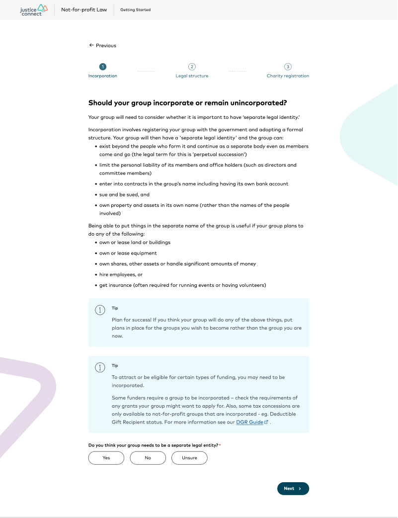
We implemented a completely new UI with unique branding for each tool
As well as the UI changes, we added a tool home page, an introduction page for each tool, and either a progress bar or progress steps for each tool.
This updated Getting Started tool screenshot shows the new UI, the content and form functionality has not changed.
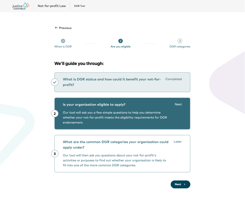
The updated DGR tool includes these progress steps to support users as they progress through the tool.
Outcomes and what I learnt
As the changes rolled out after I finished at Justice Connect, I don’t know all the results, except that they increased engagement by 336%. There was also an advertising campaign based around the new branding that would have helped this.
I was proud of our ability to quickly pivot the project’s aims and sell the new approach to management. Despite having a small team and small capacity due to other projects, and me doing my handover, we achieved a great outcome.
I had a few learnings from this work. The main one was properly doing some due diligence before the project started. We knew for several months that this work was going to happen. If I’d done some initial prep work, I would have caught that the data reporting wasn’t correctly set-up, and we could have fixed that and had enough data to identify some problems within the tools.